Table of Contents
How to Color Cap Walls: The Complete 2026 Guide
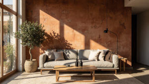
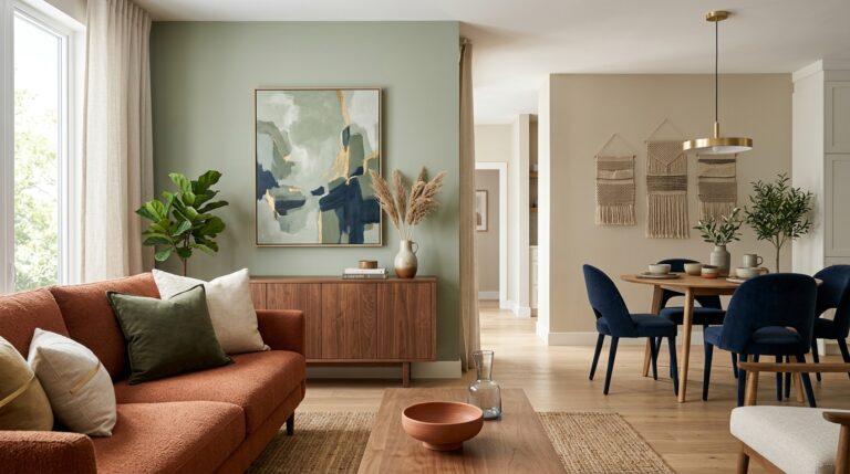
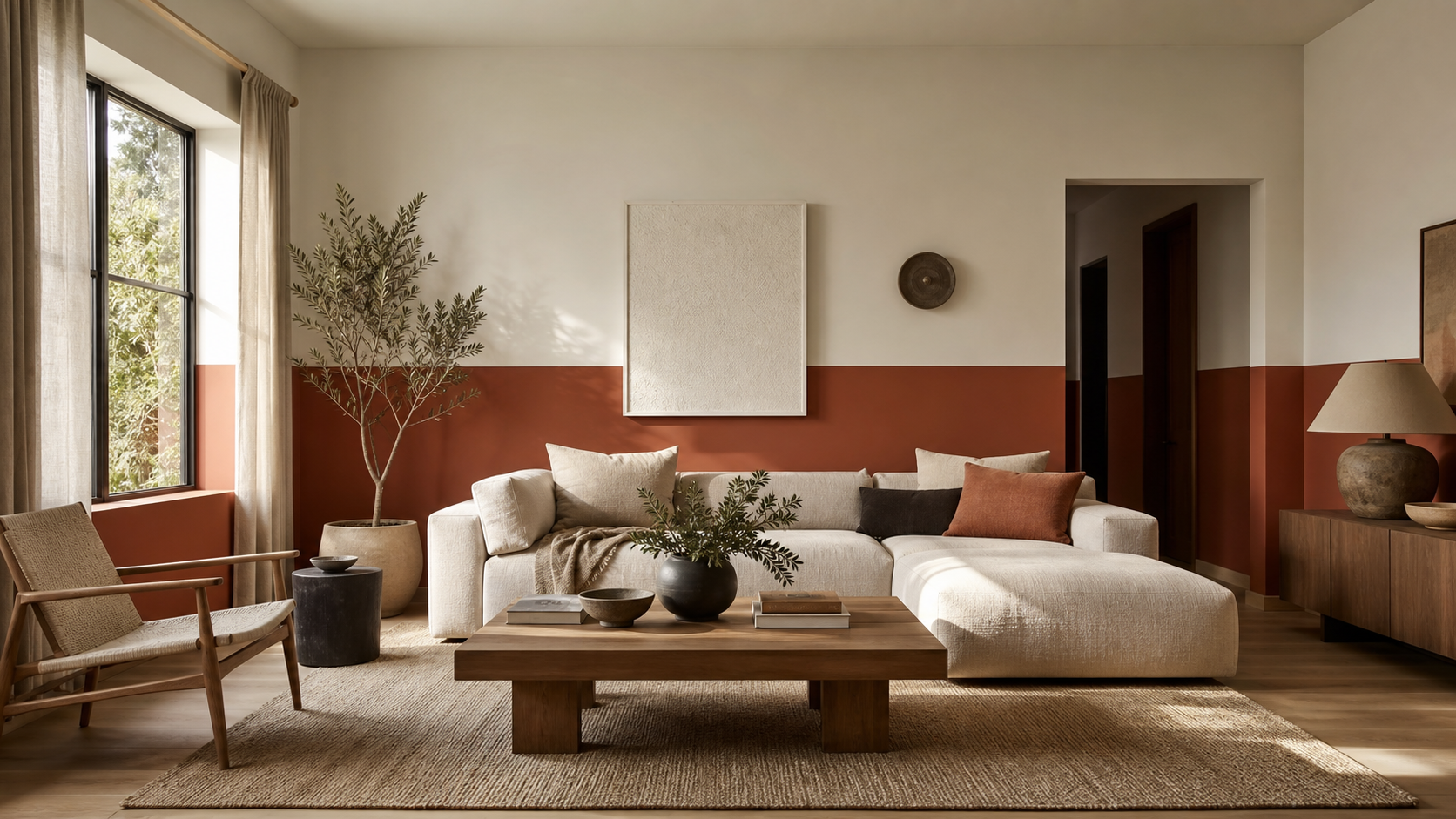
Walk into a living room where the lower third of every wall is painted in warm terracotta while the upper walls stay soft cream. The room feels anchored, layered, and put-together without a single piece of new furniture. That is color capping, and it is the most talked-about wall paint technique of 2026. This design strategy transforms flat spaces into dimensional environments, offering a sophisticated look that rivals expensive architectural molding.
This guide covers everything: what color capping is, how it differs from similar techniques, what tools you need, and the exact step-by-step process to do it yourself on a weekend. Whether you are a homeowner looking to increase property value or a renter seeking a reversible upgrade, this technique offers flexibility. For more budget-friendly transformations, explore our Ultimate Living Room Makeover Guide Under $500 to complement your new walls.
What Is Color Capping and Why Is It Popular?
Color capping means painting the lower portion of your walls in a contrasting or deeper color, then leaving the upper wall and ceiling lighter. The split sits roughly one-third to one-half up the wall, with or without a physical rail or molding to mark the divide. This technique creates a visual foundation, grounding the space while allowing the upper portion to reflect light and maintain an airy feel.
Elle Decoration named it one of the defining paint trends for 2026, noting its ability to add character to rental properties and new builds alike. Decorilla confirmed it as a first-mover opportunity in their 2026 trend roundup, highlighting its versatility across different interior design styles from modern farmhouse to mid-century modern.
How It Differs from Color Drenching
Color drenching covers walls, ceiling, and trim in the exact same shade to create an immersive, monochromatic effect. Color capping is the opposite: it uses contrast. The lower wall grounds the space with a deeper or bolder tone. The upper wall and ceiling stay light, which draws the eye upward and makes the room feel taller. This distinction is crucial for small rooms where drenching might feel too oppressive.
How It Differs from a Two-Tone or Split Wall
A standard two-tone split is simply two colors divided at mid-wall. Color capping is more intentional: the lower color is chosen to anchor and “cap” the base of the room, like a visual foundation. The split line can follow chair-rail height (about 32 inches from the floor), one-third of wall height, or one-half, depending on the room proportions and ceiling height.
Why This Works Visually
Placing a darker, warmer, or more saturated color at the bottom of a wall mirrors a principle decorators have relied on for generations: heavy below, light above. It reflects the natural world, mimicking the dark ground and light sky, and makes a room feel stable and cosy without feeling closed in. This psychological grounding effect is why the trend persists beyond typical seasonal fads.
Color Capping vs. Wainscoting: Which Should You Choose?
Color capping and wainscoting look similar on Pinterest, but they are built differently and serve different budgets. Understanding the distinction helps you decide where to allocate your renovation funds.
Wainscoting uses wood panels installed permanently on the lower wall. Color capping uses only paint. That single difference changes the cost, the skill requirement, the renter-friendliness, and the time to completion entirely. While wainscoting adds physical texture, color capping adds visual weight without the construction hassle.
| Feature | Color Capping | Wainscoting |
|---|---|---|
| Materials | Paint only | Wood panels + paint |
| Cost | Low (paint + supplies) | Medium to high |
| Renter-friendly | Yes (usually reversible) | No (permanent installation) |
| Time to complete | 1-2 days | Weekend to weeks |
| Texture | Flat or eggshell | Dimensional, raised panels |
| Skill required | Beginner to intermediate | Intermediate to advanced |
Color capping gives you most of the visual impact of wainscoting at a fraction of the cost. For renters or anyone on a budget, it is the smarter choice. However, if you own your home and seek increased resale value through architectural detail, wainscoting may be the better long-term investment.
Choosing Your Color Combination
The safest starting point is two shades from the same color family, with the darker shade on the bottom. Color selection is where most people either get this technique right or get it wrong. Colors behave differently on a full wall than on a paint chip, and your room’s lighting changes them further. North-facing rooms require warmer tones to combat cool light, while south-facing rooms can handle cooler hues.
If you want to test color schemes digitally before buying a sample pot, tools like Sherwin-Williams’ ColorSnap Visualizer let you upload your room photo and preview colors in place. This technology reduces the risk of purchasing gallons of paint that do not work in your specific environment.
For more budget-friendly ways to refresh your whole space at once, see our guide to how to make a room look expensive cheap. And if you are planning a full wall refresh, our DIY accent wall ideas for the living room covers complementary techniques that pair well with color capping.
Rule 1: Keep the Darker Shade on the Bottom
Dark on the bottom grounds the room. Light on the top opens it. Reversing this (dark on top, light on bottom) can work in bold design contexts, but for most rooms it makes the ceiling feel heavy and the floor unstable. Stick to the natural gradient for the most timeless result.
Rule 2: Use at Least Two to Three Shades of Difference
Pick colors at least two shades apart on the same color strip. Three shades of difference gives you a clean, visible contrast. If the two shades are too close, the split reads as a mistake rather than a design decision. You want the eye to clearly register the intentional divide.
Rule 3: Test Before You Commit
Never skip sampling. Buy a sample pot, paint a 12-by-12 inch patch on the actual wall, and observe it at three different times of day: morning light, midday, and evening with artificial light. Colors shift depending on light direction and bulb temperature. According to the U.S. Department of Energy, lighting temperature significantly impacts color perception in home environments.
Popular Color Combinations for 2026
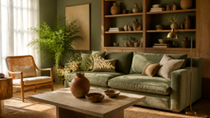
- Terracotta lower / cream upper: Warm and grounded. Works in living rooms, kitchens, and dining spaces.
- Forest green lower / off-white upper: Fresh and garden-inspired. Strong for bedrooms and entryways.
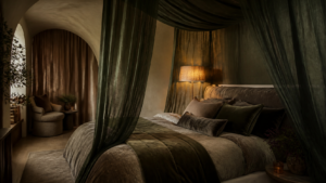
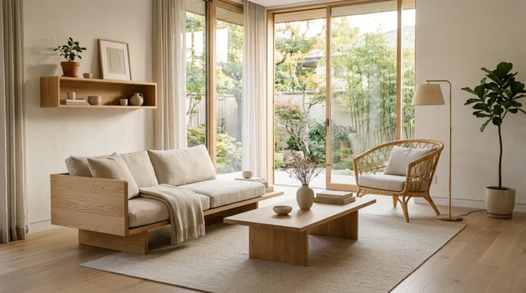
- Chocolate brown lower / soft sand upper: Rich and cosy. Very strong for bedrooms and reading nooks. Related reading: Japandi Interior Design 2026: 12 Budget-Friendly Ideas
Get the 4casahome digest
Honest reviews and no-hype guides — straight to your inbox. No spam, unsubscribe anytime.
Some links in our articles are affiliate links. See our full Affiliate Disclosure for details.